Delayed Update and LAUNCH!

Sorry for the terribly but unintentional late post, but there has been substantial progress on my part ever since the semester started!

I’m working on page 27 of Fabulae Orsa as of now, and I will be continuing on to get things done quickly! I have a total of 62 pages to complete (including master/colored art pages), so that would it 27/62 complete – about 45%, right? But that’s only as far as the ‘drawing’ part goes.

I hadn’t really planned on it either, but apparently I’m to have my own solo show sometime in the end of the semester – which means I REALLY have to crack down on the drawing now!

So in case you haven’t known yet, I’ve also already done a quick few tinkering on the first few pages I’ve drawn, inked in, scanned, and toned on Photoshop CS5. The link to the Fabulae Orsa web comic is posted here.

These will be, more or less, what most of the pages will look like. I’m hoping that I’ll undergo substantial progress and technique improvement as the time doing these pages goes on. Maybe I’ll even be able to see the progress myself (I’m a pessimist though, so I doubt it). Even so, I hope you guys enjoy! With the trouble exception of classes, as soon as I find the time I’ll have a lot of other things up soon too!

Update (20%)

Hello!

So it’s been a while since I’ve updated this, but rest assured! I’ve still been burning the midnight oil while cat-sitting 12 kittens over the past week!
I’m done with character designs, machinery design and environment development, etc. for the story, and will be posting the characters up as soon as I dig out my scanner from the packaging boxes. As for the story, I’ve already drawn out 12 of the pages… out of the 60. So that would be 20% if you look at it that way (though I have the tendency to go back and redraw and erase/do-over many things).

All in all, I’m trying to be as productive as I can, and hopefully will be posting a lot more in the next post than I am currently…

Signing off now!

Spotlight On: Zarina Liew (What?! I’ve never shown this?)

After my last post and rereading my previous posts, I’ve realized that I had never posted anything on one of my personal favorites of the fashion illustrator/artists that I’ve seen thus far. How could that be? I think after my first post on Maguerite Sauvage, I forgot that I still had to post an entry on Zarina, because I discovered the two of them at roughly the same time.

In any case, it’s time for me to introduce you to Zarina Liew, a personal favorite of mine. Why is she my favorite, you ask?

I honestly have a hard time answering these types of questions. With artists, it’s easy for me to fall in love with their artwork, sometimes even ones that are reminiscent of others and are not as good-looking as you would assume. But I suppose everyone has different tastes. I myself like Zarina Liew’s vibrant colors, watercolor affects, flowing rhythm, and highly stylized legs and adorable faces. She also uses lovely colors, patterns, and a dreamy, pastel look to all of her works. I was actually influenced by her a long time ago on a project for my Computer Art class, and that was when I first started looking at her work.

My first encounter with Zarina Liew’s work centered around one particular piece I enjoyed very much, both in its composition and colors.

On the very bottom is her “Grateful Crane” piece, illustrating the Japanese folktale of a poor man who is blessed by a crane spirit after he saves her. She, in return, gives him a lot of wealth by weaving precious, rich cloth for him to sell. However, she tells him never to look into her warehouse when she is weaving the cloth, but he does so anyway. Once he sees that she plucks the feathers from her own body to produce this wonderful silken cloth, she flies away and he loses her forever.

For my class project, we had to illustrate the story and the concept behind it in two separate art pieces (the two pieces shown below). I chose this tale because her painting inspired me to do so, and because the concept behind it centered around moral values (as does any other folktale, I suppose). This project can also be found on my artist website here.  In any case, this was the first time I encountered Liew’s work, and she directly influenced me to produce the two pieces. As you can probably tell, I tried to emulate her colors in the left piece. In any case, I hope you enjoy!

Spotlight On: Cassandra Rhodin

Firstly, I’d to explain that I’m not really that into fashion in terms of clothing and what I wear. It’s just the illustrations of fashion that fascinate me, and I have a feeling that it’s due to the heavy amount of stylized features they use, especially the legs and faces.

Cassandra Rhodin is a Swedish fashion illustrator whose name is more or less known in the fashion world. I, myself, have never heard of her name and only came to know her through research on generic fashion illustrations.

Though I know I mentioned previously that I tend to be drawn to stylized and elongated arms, fingers, legs, etc., Cassandra Rhodin’s figures seem to also emit a strange emphasis on facial features in the head, whereas the elongated figures seem more of an side-effect than a main feature in her drawings.

They eyes are gigantic, of course, and the eyelashes and makeup is considerably drawn out and abundant. Even the hair is stylized and the lips drawn fuller than normal.

Though different, her artwork gives me a strange feeling, sometimes humorous, other times creepy. The clothes, which are (I assume) the most pivotal point of a fashion illustrator’s work, are designed with mainly neutral colors, none too vibrant. Though I understand that skin for fashionable subjects or figures should be pale, she rarely seems to use any color on her figures, only their clothes, which gives the viewer a more focused look on the clothes and accessories they’re wearing, I suppose. Her compositions also incorporate, on the most part, a sense of symmetry or pattern. I think this is why sometimes when I look at her work I get a strange, creepy feeling because it looks somewhat unnatural.

She also draws these really bizarre animals, such as rabbits, ostriches, cats, dogs, etc. in her work. It almost seems to be incorporating a personal fetish of hers into her work. One of the other noticeable contingencies in her work is the fact that all of the eyes in her figures share the same design. Though I realize all the works are by the same artist, I’m trying to say that there is little differentiation between them.

I regard eyes in an artwork to be the drawing point for viewers. Personally, I start drawing a character with their eyes first (after drawing the general outline, of course), and then I work from the eyes to the rest of the body. I try to make them to most detailed of all – this, I think, is one of the main points that sets manga apart from other comics. The lips, on the other hand, are not as prominent a feature in manga (unless you are a mangaka interested in fashion like Ai Yazawa).

Though she isn’t as influential an artist to me as Zarina Liew or Natusme Ono, if you guys are interested, check her out!

Progress

So taking a few days to write up all 58 pages of Fabulae Orsa and the majority of its layout and dialogue was a lot more work than I thought. I spent nearly 5 days on and off working on what to say, how the characters would look, etc. The thumbnails were harder than the dialogue, surprisingly.

Though I’m content with what I’ve come up with, I expected it to be only 30 pages, but it ended up to be almost 60. Hopefully, I’ll learn to tone it down some but if I can’t, I suppose it can’t be helped.

I’m trying to give myself a deadline and finish Fabulae by Aug. 22nd when classes start up again, so that’ll give me about 4 weeks to do 58 pages. Adding in a little eye candy and cover artwork for the story, I’d say starting on Sun. 24th, I’ll have to work on 3 pages per day. It seems fairly easy, but I hope I can fulfill it…

I’m already starting Xenophon’s character design, which I’m satisfied with (for now). I’ll have to draw up Phyrrus, Critias, and Hesperos next. They’re more major characters than any of the others, and it’ll give me plenty of opportunity to work on drawing males. Naturally, my next post will present these designs.

Also, since I’m having trouble sleeping, I’ve rewritten and posted the general plotlines of both Fabulae Orsa and Vitae Propositum, the latter of which has a shaky plotline and hasn’t been worked on as much, so I apologize!

But if interested, please feel free to read them! It’s a lot of material though, so be warned!

Spotlight On: Natsume Ono

So I just blogged about a not-so-popular manga artist, so here’s a more well-known one.

Natsume Ono was one of the huge artists that I love in the field of graphic novels and manga. I admire her art style the most, of all the artists in the manga world. It’s because her works is really different than others – it has a loose, relaxed characteristic that sets it apart from everything else I’ve read or seen. Mot of her drawings in fact seem to look like they’re contour drawings – messy and unplanned. Ironically, I’m the exact opposite when it comes to drawing as I like things precise and “clean”.

I first saw her style in the anime series, Ristorante Paradiso, a fairly popular anime and manga series. I think it portrays her style and interests fairly well. If you browse the link above to her website, you’ll immediately notice that she’s very interested in Italian culture. In fact Ristorante Paradiso, her debut series, took place in Rome.
Her characters may look strange when you look at her drawings, so it takes a while to get used to. I’d even say it requires a specific taste to like her drawings, and fortunately I have it.
Her works reminds me a lot of fashion illustrations, messy and stylized. Her characters have long fingers, legs, arms, and eyelashes. They look like porcelain doll figures, but more aesthetically pleasing. Her colors are also fairly simple and look as if they were just slapped on in the last minute. She uses mainly neutral color schemes, a color selection that I approve of. I also enjoy a lot of her Italian cultural references and personal touches. I can tell she’s very interested in their surrounds, architecture, and style.

If you haven’t gotten the chance to pick up her Ristorante Paradiso series from a bookstore, I suggest you try doing so. Her characters may still contain the large eyes that many other manga artists use, but they are also all very distinct in terms of physical features. I personally feel like she is one of the few artists that really have tried diverging away from the manga and anime “norm” in terms of drawing. If anyone were to ask me to choose one person that inspires me to draw manga, I’d more than likely put her on the top of my list.

This picture is reminiscent of her more recent works, House of Five Leaves.

Spotlight On: Zelda C. Wang

Hello, hello, hello!

So I haven’t gone to work on the novel for a while now, and I’m beginning to feel guilty for the slacking, but somehow I just haven’t gotten into the mood to work at all lately.

And when I say ‘work’, I’m referring to my actual project. However, I’m still looking around the inter-webs for inspiration, tutorials, and various other techniques I could use when I do get around to start working. I’m still on the planning stage, and I’m gotten around 12 pages planned out so far for Fabulae Orsa.

But for today, I’d like to introduce an artist that I just found out about (literally about 30 minutes ago) on smackjeeves.

Zelda C. Wang doesn’t seem to be employed at the moment in any company in particular, but her artwork is very soft and light. The characters and layout of her comics, thought at times I can tell they need some work as they can be a little confusing, shows how talented she is.

But what drew me into her artwork was the Classical Greek theme. Her stories are loosely based on Greek Mythology, and though the idea may seem a little clichéd, like using the moon, stars, planets, etc. I guess you can call me old-fashioned because I’m a sucker for things like that ever since I started watching SailorMoon.

One thing I enjoyed after reading through the entire series she has up on her website thus far, is the fact that she uses Classical Greek garments, armor, and architecture. I can tell immediately that she has, at the least, done some research and homework prior to starting her projects.

In any case, her colored works are still beautiful, though after a while her characters start to look similar, especially the men, as I feel she lacks the skill to draw non-feminine males. Though it’s fine with me, that is a matter of personal taste I suppose.

Here are the links to her novel series and her Deviant Art page, hopefully many will find her as enjoyable as I, especially her graphic novels. They are short, but enjoyable!

Progress?

I’ve drawn up the pages and story/plot of Fabulae, and it’s looking to be a good 55 pages or so, which was exactly what I was hoping for (about in that range).
As for the blog, I’ll probably edit the header sometime in the future, but I’ll keep it like this for now.

I’ll work on the character designs quickly because I’m trying to get the background done quickly. But in any case, I’m still working on Fabulae Orsa.
I’ll be posting the great tree of Praeclarus Ager next, with the character designs as well!

Current Status

First of all, I know that it’s been a while since I posted anything – you’ll have to excuse me but summer classes wore me out. I decided to take a break after those quick 3 weeks and instead worked tediously (what?) on my side Project, “Trinity Scar”, on RPG Maker VX – a retro video game-making program (I know, I’m pretty nerdy.). Perhaps when I’m done (which will probably be never since I started this project back in 2008 and am still only 30 minutes of gameplay into it) I’ll post a demo onto the blog, even though it shares no real relevance to either of my projects.

In any case, I wanted to let you know that – firstly, I have NOT been slacking. In fact, I’ve been drawing in my spare time (occasionally) and am uploading a few images for you guys to see right now. These all deal with the Fabulae Orsa prequel, and I’ve made changes to the Fabulae Orsa page too. I was brainstorming and decided to change a few quick things.

This post assumes that you’ve at least skimmed through the Fabulae Orsa subpage on the menubar, so if you haven’t done that you’re probably not going to understand half of what I’m talking about. So, aside from my tangents, let’s get on with the sketches because I have a few things to say about them (actually, I have a lot but for the sake of the post, I’ll keep this as short as possible).

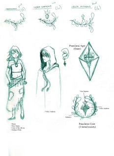
This was one of the first sketches I started when I first sat down. It’s somewhat messy, but the ideas on this page was basically forming the environment and landscape around the futuristic world, Praeclarus Ager. Now, I’m no sci-fi junkie (though I have nothing against them – I like Star Wars.) but I think I did pretty good getting my ideas on paper.

Just in case it’s hard to tell, I’ll explain right now that the gigantic, colored, diamond figure to the left is the basical idea of PA. Like I explained, it’s divided into two parts, top and bottom. Obviously the earthly bottom would be inhabited by the poor while the upper level is inhabited by technology and the “wise”.

Since I pictured a futuristic world, I tried to look into renditions of landscapes and buildings done by other people. I found some really neat things and have listed some of them on the top right corner for you guys.

Praeclarus Ager’s top half is known as Caelus, or “Sky”. I wanted it to look like a very technologically-driven city scene. It has very tall builidings, lots of skyscrapers, and is very busy. Business takes place up here, even for the meager Ordinavi, so it’s inhabited by lots of people during the day. The railways and roads are placed everywhere for convenience, many reaching above the ground like roller coasters – this idea was neat because these spiraling highways are both for the people’s convenience (and maybe even their pressing nature) and for the beauty of their new-age technology with which they have become so reliant on.

Personally, I liked the train stations design the most. I grabbed the idea from a proposed skyscraper design in Dubai known as the Anara Tower (which you can see here), implementing the different level sky gardens in the tower as separate train stations, with the gigantic windmill fan substituted by a clock instead, as all people rushing to get somewhere would need one. Since the Anara Tower was never finished as the project was cancelled in 2009, I want to try making a parallel universe where it is one of the prominent buildings of Caelus.
As I noted before, I’m no sci-fi fan, but I still watch them (even the new Star Trek movie). However, I can undoubtedly say that I’m NOT a car fan. I don’t mind even know how to drive and I’m almost 22,so I’m definitely not interested in them. However, this project gave me a different perspective on them. I knew I was going to have to think up some car ideas and sketch them out, and I dreaded the idea. But when I started drawing them, I didn’t look half as bad as I thought it would. In fact, I’d say they were pretty successful.

Although I was looking at numerous references online, I tried to implement many of my ideas into these designs and picture them in the world of Caelus.

The only one that didn’t turn out as well is the automatic doors, which I thought were really cool at the time. I got a lot of these ideas by looking at the designs of cars on websites and images such as Next Concept Cars, the Aptera Prototype, 2015 Mercedes Benz, and various Ferraris (basically car names that I knew of, but in a futuristic twist).

Finally, I’ve also got a concept of the people and mainly their fashion. Though humans do change physically, as I’ve learning in Anthropology course over the summer, we don’t change over a fast period of time, so small changes can barely be noticed over the years. That’s why I’m sticking with normal human proportions (meaning no elf ears, hybrids, etc.). Keep in mind that this is NOT what the artwork in my novel will be like, it’s just a few sketches.

Firstly, I’m thinking of a icon, or crest, for Praeclarus, which is what it at the top. It’s supposed to be a three-tier crest for each of the three classes. But after looking at it for a while I thought that it might look strange, and implemented the idea into the emblem on the lower right, each symbolizing a class.

I also wasn’t sure what the people of the future would wear – and I definitely wasn’t thinking of spandex or Tron. Though Technology is important, I wanted them to still look thrifty and fashionable to our eyes. The Ordinavi were easy for me to think of. Since they live in a underground, natural environment I wanted to give them a little bit of their new age technology in their clothes (assuming they bought them in Caelus), thus was born the idea of fiber optic clothing! I was actually disappointed to see what fiber optic clothing had been invented thus far, none of them looking particularly appealing to me personally. But you win some and lose some – this could be a new-age fashion statement. It’s sometimes good to keep things interesting and different, and I think Fiber Optics look neat still.

In any case, sorry for such a long post, hope I didn’t bore you! I’ll try to keep up to date!

A few things left on my to-do list in terms of the blog is to (1) Create the banner (2) Draw out the Wallpaper, the latter of which requires that I have drawn out and familiarized myself with all the character designs for not only Fabulae Orsa, but also Vitae Propositum (I’ve got my idea behind it since way before I started this blog).

See you next time! 🙂

Spotlight On: Alice Duke

Three words: Green and Brown.http://www.alice-duke.com/portfolio/alice-duke-cerberus.jpg

Apart from her classy name, Alice Duke has been as artsy as they come. She is a freelance illustrator with fantastic skills in Photoshop, Illustrator, and drawing.

Most of the subjects of her work include “imaginary animals, lasers, transforming humans”, and folklore. She definitely uses a lot of visual textures, and mythological inspiration.

Her main focus is “book illustration, video game concept art, visualization for films, character/creature design, posters, sequential work, private commissions”.

Slime DragonMost of her pictures seem Photoshop-oriented and have a recreational concept.

I absolutely adore her use of natural colors. It may be because I myself am a fan of these colors that I like them, but they are very appealing to me. The way she draws her paintings by pencil first is also very similar to my own style as I’m not too well adapted to the Wacom tablets. As she claims in the mini-biography, she’s very into folklore and mythology, and a lot of her creativity seems to revolve around interpreting them in her own way. I’m also very similar to her in this way, in particular to Greek mythology and philosophical ideas.

More importantly, she also has a link to her character designs and illustrations for a graphic novel, which is exactly what I inspire to do.

She really seems to like using that wave-like spirals and lines as a texture and movement in her compositions, and it’s similar to the spiral leaves design that I do too, which is another reason I liked her. A lot of her work has nature in their theme, which is probably why there’s so much green and brown. She has twisted wood branches, tigers, people, and a lot of fantasy creatures as her subjects. However, she also has very creative ideas incorporated on her figures, as well as a nice texture.

Her humans also look like they’re taken from fashion illustration art models and cartoons, a approach that I’m trying to take when I develop my graphic novel.

Previous Older Entries